

mage courtesy of iosphere at FreeDigitalPhotos.net
Mobilegeddon: it sounds scary, but it turns out its bark was much worse than its bite. The update that struck fear in the hearts of Webmasters everywhere didn’t have nearly as much of an impact as expected (think Panda) and, as the dust settled, most sites found themselves relatively unharmed.
That being said, now that the algo is in full swing those sites which did drop a couple of places can expect to slide a few more as Google releases updates and, more importantly, sites which still aren’t properly optimized for mobile are missing out on the ever-increasing number of mobile browsers and buyers.
Let’s find out whether or not you’re a victim of Mobilegeddon and then discuss how to go about preparing your site to capitalise on those mobile opportunities.
Was it Mobilegeddon?
So your website has dropped or gained a couple of positions/clicks but you’re not too sure whether this has to do with Mobilegeddon or something else. Here’s how to use Google Analytics to check:
Step 1: Create a mobile traffic custom segment
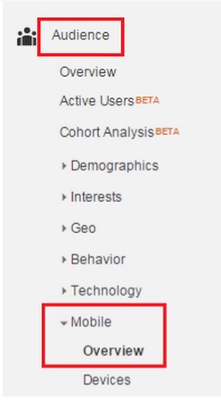
First, you’ll need to create a segment that shows you only the traffic from Smartphones. To do this click:
- Audience
- Mobile
- Overview
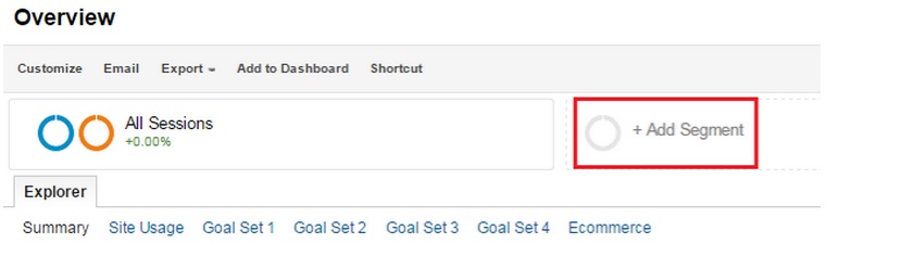
Then click the ‘+Add Segment’ tab:
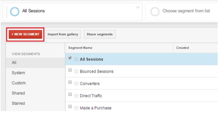
Click ‘+New Segment’
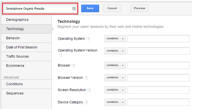
 And give this segment a name. For example: Smartphone Organic Results.
Step 2: Add organic traffic to your Smartphone segment
In the left hand menu, click ‘Technology’, select ‘Device Category’ and choose ‘Mobile’.
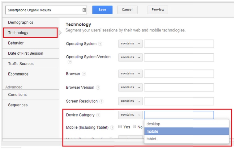
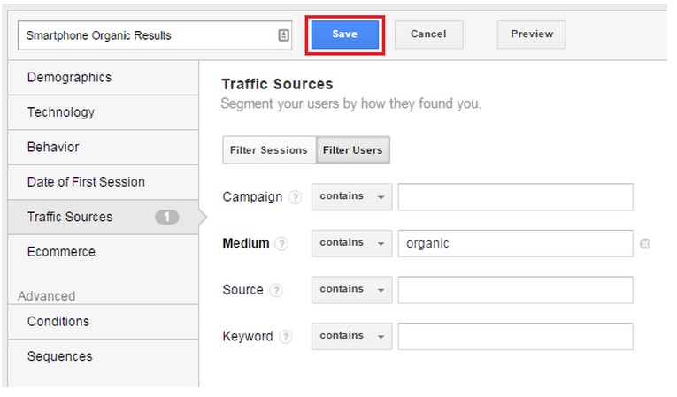
Now click ‘Traffic Sources’ on the left and in the ‘Medium’ category choose ‘Organic’.

Save the segment.
Step 3: Review trends
Now go through the results – paying particular attention to changes in the traffic according to the date.
Have a look at your numbers the month before mobilegeddon’s release and then compare the data for the same days the month after.
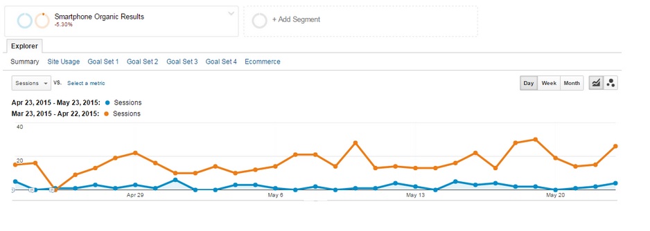 Do you notice any changes post vs. pre? If you see a drop, chances are you’ve been affected.
What to do if you’ve been hit:
Ouch. So you’ve been stung. The algo has dropped you a couple of points and now you need to start the recovery process.
The good news is that there are a variety of ways which you can go about optimizing your site for mobile – all of which are relatively simple. Below are 3 site design options which you (or your tame web developer) can set up.
Option 1: Responsive web design
This gives the same HTML code on the same URL regardless of the user’s choice of browsing device and will change the display based on the device’s screen size.
This is Google’s recommended option.
This option uses the same URL regardless of device, but provides a different version of HTML for different device types (based on what the server picks up about the user’s browser).
This design serves different code and separate URLs to different devices. It essentially tries to recognise the user’s device and then redirects them to the appropriate page according to what it has detected.
5 extra tips for making your site mobile friendly:
1: Adjust your font size
It’s generally recommended that your front should be at least 14px to ensure that your visitors (some of whom might be over the age of 50) can read your content without having to zoom in too much.
- Adjust your viewpoint width
This ensures that your content isn’t wider than the screen. People are happy to scroll down, but not sideways. Make sure that your images and tables are optimized too. The best way to ensure that you haven’t left anything out is access your site from your own device and see for yourself.
- Add a viewport Meta tag
A viewport provides the web browser with instructions on how to scale the page automatically depending on the size of the user’s screen.
- Check your plugins
Your plugins must be compatible with and supported by mobile browsers. Flash, for example, is not compatible and so any fancy animations will be lost on mobile viewers.
- Size your tap targets appropriately
Make sure that your links and important tap targets (like menus and call to action buttons) are a good size and spread out nicely so that people (with man-fingers) can click on the right one the first time. Google wants them to be at least 48 CSS pixels tall/wide.
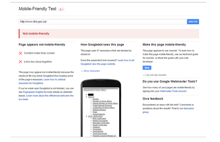
Check your repair work:
Google wants you to win at this. Promise. They’ve even made a mobile friendliness tool which you can use to check. This will help you see if your site has been optimized properly and will highlight the areas you’ve missed if it isn’t.
Once your site is optimized for mobile access you should have no problem restoring your rankings to their former glory.
Conclusion:
And there you have it. You now know
- How to set up your analytics report
- How to use the process to determine whether or not you’ve been hit by Mobilegeddon
- The 3 primary methods of mobile optimisation
- 5 simple ways to improve mobile-friendliness and
- How to check the effectiveness of your repairs
Going through the optimization process really is important because, even if you weren’t badly hurt by Mobilegeddon Google will continue to update this algo (perhaps more aggressively) and, more importantly, people will continue using their phones to browse and buy. That means that regardless of what Google wants, you should be mobile-izing your site for the sake of your users and for the sake of, well, your site.
Tags: content marketing, guide, mobile, mobilegeddon, SEO
Stay In The Know
Cut the clutter and stay on top of important news like this. We handpick the single most noteworthy news of the week and send it directly to subscribers. Join the club to stay in the know…
About Steph Von der Heyde
Our resident wordsmith’s love of digital lured her over from advertising to the online space, where she fell in love with content marketing. Since coming to the online world Steph has made her mark on all outgoing CleverClicks copy and is passionate about using words to build brands. Her obsession with the writing is rivaled only by her love of trail running, yoga and green juice. When she’s not submerged in content strategy you’ll find Steph in Downward Dog.