
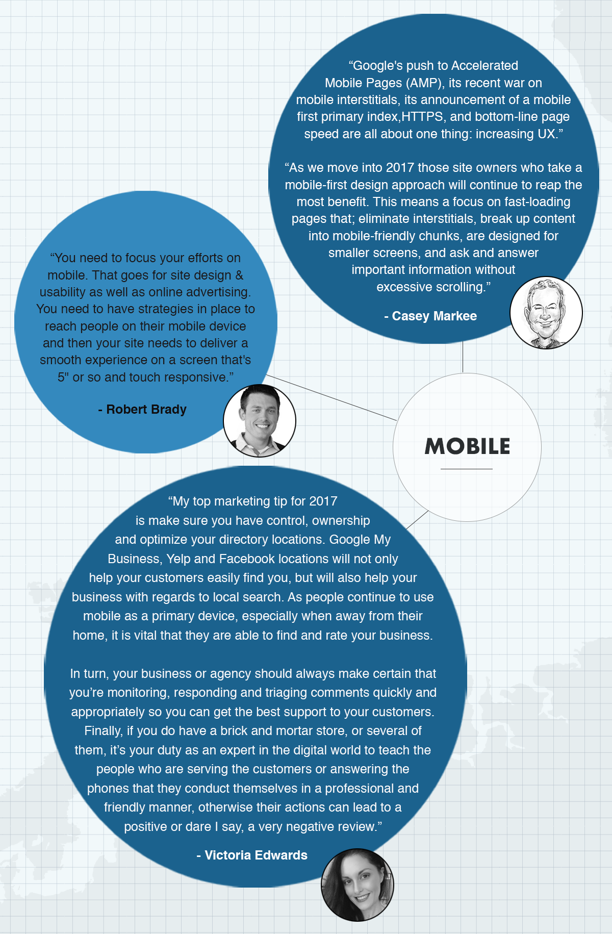
If we learned anything from last year (and all the 2017 trend predictions), it’s that the future is mobile.
Mobile has already overtaken desktop searches, with 58% of all search queries being made on Smartphones, and now the much-discussed mobile-first indexing has started rolling out.

What is ‘mobile-first’ indexing?
It means that Google’s algorithms will primarily use the mobile version of a site’s content to rank pages from that site, to understand structured data, and to show snippets from those pages in their results.
In layman’s terms, only mobile pages will be seen in the index, and no desktop pages.
That means that if the mobile version of your site has less content or is stripped-down in some way you should be concerned, as it’s that version that Google is going to see.
Pretty big news for website owners and digital marketers. So, it’s safe to say that getting your mobile site up to scratch should be top of your do-list this year.
If you’re wondering how to get started, below are 5 steps to follow to ensure a happy and prosperous 2017 for your website and your business.

Audit The Mobile Version of Your Site
If you want to be mobile-first you first need to get mobile-friendly. You’ve probably (hopefully) already done this, but it’s a good idea to make regular checks and get your mobile friendliness score as high as you can. Get tested here.
When doing your mobile audit, something to note is that Google suggests using responsive design over having a separate mobile website. If you have a separate mobile website, ensure that the primary content (including structured markup) of your desktop and mobile website are the same, if not similar. And, ensure that the appropriate canonical and rel alternate tags are added, to avoid duplicate content issues.
Some other common issues to look out for include:
- Slow mobile load times
- Broken or incorrect redirects
- Uncompressed images
- Blocked resources including JavaScript, CSS, and images
- Unsupported or unplayable content
- Intrusive pop-ups and other interstitials
- Mobile-only 404 errors
- Small hard-to-read text and call-to-action buttons
Start optimising for Voice Search
Mobile search is increasingly done via voice. It’s quicker and easier than typing, and A.I assistants like Siri, Viv and Alexa have normalised the concept of voice commands and brought it into our everyday lives.
Google announced that voice search is the fastest growing type of search and have previously told us that about 20% of all searches are voice searches. If you want to get the most out of mobile users, optimising for voice search is an important step.
In order to do this, you need to understand the HOW and the WHY of voice search.
WHY people voice search:
According to Google’s Guide, voice search is most commonly used to satisfy four different types of queries:
- I want to know
- I want to go
- I want to do
- I want to buy
HOW people voice search differently:
- The queries tend to include more filler words (i.e are more conversational) than searches made on desktop. For example, a desktop search of “Sushi Manly” is more likely to be “Where is the best sushi restaurant in Manly?” when searched using voice.
- Because of the conversational nature of voice search, search queries also tend to be much longer in the tail.
- In addition, voice searches generally contain more question words (what, when, where, how and why).
- They also tend to have a heightened local focus, as people are often on the move and poised to use their phones to navigate.

Capitalise on Local Searches
As mobile search became more popular, so local searches increased. If you look at the most common mobile queries (I want to know/go/do/buy), there’s a local aspect to 3 out of 4 of them.
Bottom line: you really want to be one of the top results when a local search is made.
To improve your local rankings you’ll need to go through the following steps:
- Register with, and optimise, your Google My Business
- Include high-quality photos of your business
- Keep your NAP (name, address, phone number) consistent across every website/directory you’re listed on
- Include detailed rich snippets/schema markup
- Encourage reviews from customers

AMP it up
Google promotes AMPs (Accelerated Mobile Pages) above regular pages on mobile. AMP pages result in much quicker load speeds and, therefore, vastly improve the user experience.
The process for setting up AMP for your mobile pages is different depending on your CMS, but in cases like wordpress it’s just a simple plugin. If you haven’t looked into it, now’s the time.

The bottom line:
Users already use their mobile phones as their primary device, so if that isn’t enough motivation to act, we’re not sure what is.
As we move through 2017, there’s no denying that those who take a mobile-first approach will reap the rewards – will you be one of them?
About Steph Von der Heyde
Our resident wordsmith’s love of digital lured her over from advertising to the online space, where she fell in love with content marketing. Since coming to the online world Steph has made her mark on all outgoing CleverClicks copy and is passionate about using words to build brands. Her obsession with the writing is rivaled only by her love of trail running, yoga and green juice. When she’s not submerged in content strategy you’ll find Steph in Downward Dog.