
The importance of your landing page can’t be understated. It’s the mechanism which acts as a funnel for all your potential clients who need your help.
So if someone’s looking at your landing page, it’s quite likely that they’re actively looking for whatever you’re offering. So why wouldn’t they convert?
Basically, because your landing page is giving them a reason not to (and possibly more than one).
There are a few obvious reasons why this might be the case, but below are the 4 non-obvious things that might be sneakily killing your landing page conversion rates without your knowing:
1. Stock images
That’s right – those free, high quality images you find so convenient are actually making you unoriginal and boring.
Visitors to your landing page can immediately tell when they’re looking at a stock image. They don’t look genuine, and they make your landing page seem lazy. Not to mention that they’ve probably seen that exact image a hundred times before.

Don’t let these phonies be the face of your honest, hard working business.
Save those stock images for blog posts if you have to, but when it comes to driving conversions from your landing pages, avoid at all costs. Rather use genuine and original images of your own.
2. Boring button copy
Button copy may seem trivial, but it really does play a huge role in conversion rate. After all, the whole point of the landing page is to get people to click the button – so it’s such a shame how often boring button copy is used.
People visiting your landing pages don’t even know it themselves, but boring button copy is preventing them from clicking on it. Don’t you think people want to “Talk To Us” rather than just “Contact” (yawn).
I mean, which one looks more enticing to you?


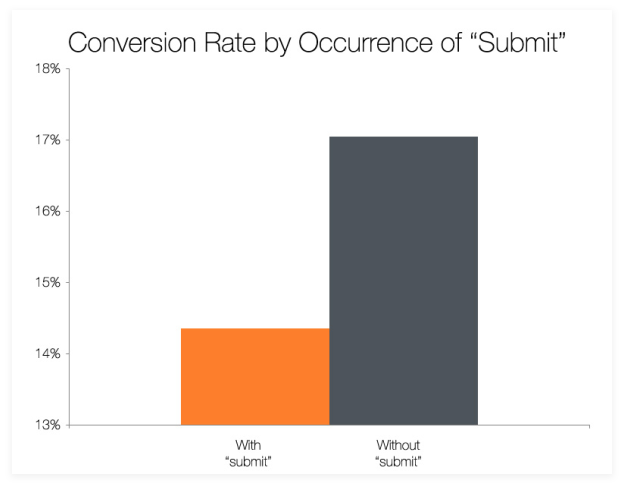
Hubspot did an interesting study to prove this point. They found that a landing page which used the word “submit” as their button copy only converted at 14%, compared to 17% when more enticing button copy was used.
So give your users that extra little nudge to cross the finish line and click that button!
3. Your landing page lacks credibility
You sometimes have to help your visitors see why you’re the honest, trusting brand that I’m sure you are. After all, you are trying to sell to people over the internet, so you can’t be surprised if people need a little extra something to gain your trust.
Here’s a great example by the online software Swydo, using the testimonial of our very own CEO on their landing page:
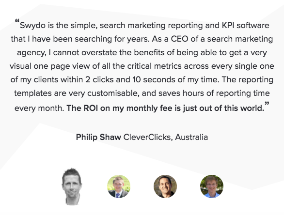
This works really well since it uses the name and face of a real customer, as well as the name of their company. Including their position in the company as well would probably be one notch better.
It’s said that 68% of visitors are more likely to convert if reviews from real customers are included on a landing page (assuming everything else is in check, of course).
Another really effective way to improve credibility would be to include an official ‘trust badge’, if your industry allows it, or accredited organisations that your brand is associated with, like these:

You know a brand means business when they’re associated with accredited organisations.
4. Not enough testing
Testing is your golden ticket to increasing your landing page conversion rate. You can’t gain any real insight into how your landing pages are performing, if you aren’t testing them against other variations of themselves.
The best way to do this is A/B split testing, which allows you to send some traffic to landing page A, and the rest to landing page B.
After a period of time you can compare the results, and implement the ‘winning’ landing page for your campaign going forward. But it doesn’t end there.
You then need to test this winning landing page against one with different variations than before. You can look into changing literally anything, from the call-to-actions to the whole design of the page. The possibilities are endless.
Data shows that landing pages which have been tested and changed over 40 times get up to 12x more conversions than those with only 5 or less different versions.
So with the right testing process in place, it should just be a matter of time before you hit the prime conversion rate of your dreams.
Resources:
https://www.entrepreneur.com/article/237159
https://blog.kissmetrics.com/landing-page-flaws/
https://blog.wishpond.com/post/95467061386/7-landing-page-design-mistakes-killing-your
https://www.crazyegg.com/blog/remove-landing-page-elements/
Tags: conversion, landing pages, online
About Anika
Anika is our digital marketing creative and social media guru, with a passion for everything design and user experience optimisation. She's passionate about strategising new campaigns and utilising her knowledge of the psychology behind the consumer’s journey.
Outside the office she spends most of her time outdoors or trying to be the ultimate master chef.